Label Component
The label component is used to insert a label text on a board to identify something. We might use the label component to add a title or to add a small description to another component. The label content can be a simple text or an html content.
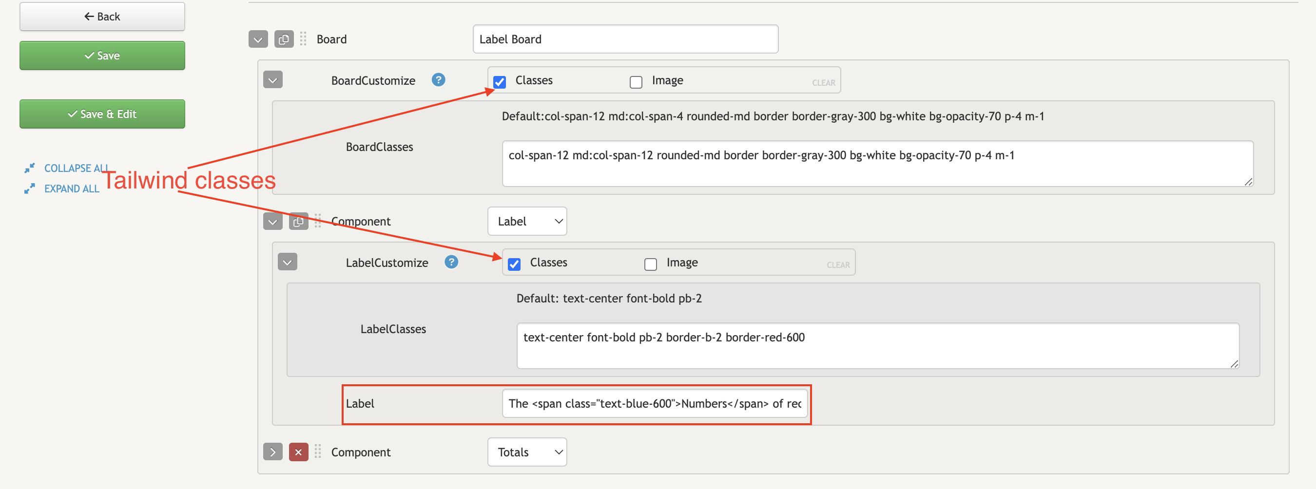
- LabelCustomize: used to add css style and image background to the entire label section
- Label: contains the content of the label that will be displayed on the page. The content can be simple text or html
Example:
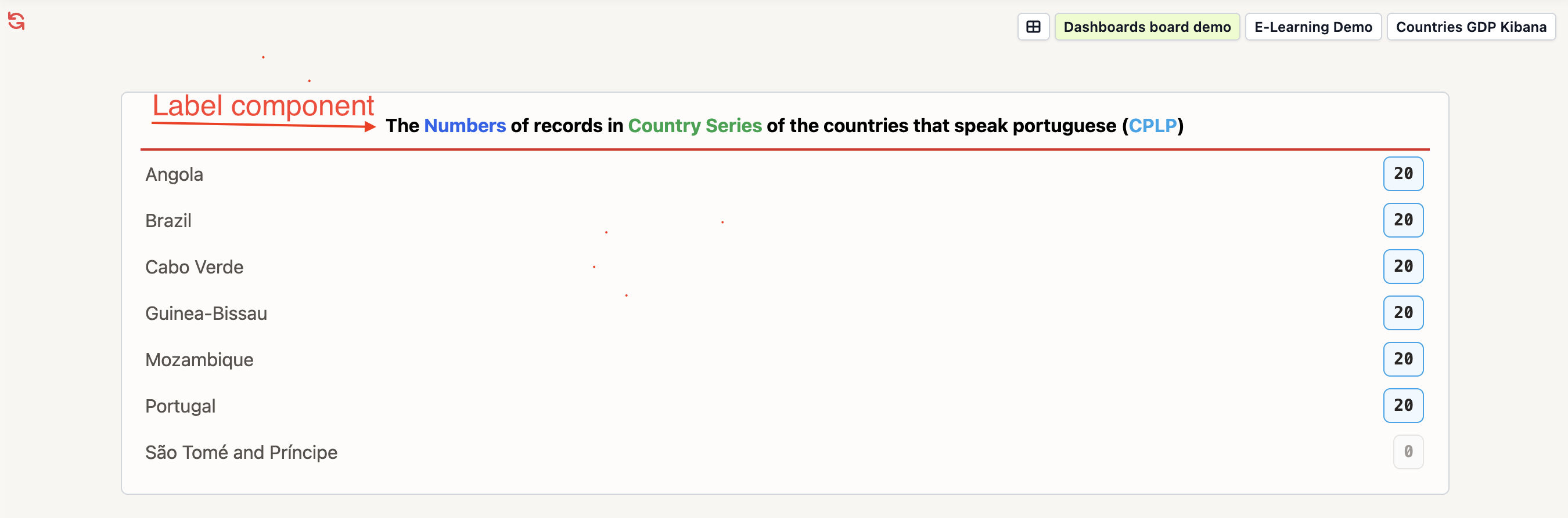
The following image shows an example of a label component which is used to describe a listing of record counts:
BoardClasses: `col-span-12 md:col-span-12 rounded-md border border-gray-300 bg-white bg-opacity-70 p-4 m-1` </br>

LabelClasses: `text-center font-bold pb-2 border-b-2 border-red-600` </br>

Label: `The <span class="text-blue-600">Numbers</span> of records in <span class="text-green-600">Country Series</span> of the countries
that speak portuguese (<a class="text-sky-500" href="https://www.gov.br/mre/en/subjects/international-mechanisms/inter-regional-mechanisms/community-of-portuguese-language-countries#:~:text=The%20Community%20of%20Portuguese%20Language,Principe%2C%20and%20Timor%2DLeste.">CPLP</a>)`