
# Creating a Dashboard
# Dashboard Creation
In order to begin creating a new dashboard, we simply need to create a new instance in the Dashboard_v1 definition.
We start off by giving it a Name and a Description, and then we can create what is the base of the dashboards we will create, a "Board". Each "Board" will have multiple "Components", and at the moment there are a few possible types of "Components", which are:
- Label
- Menu
- Totals
- Kibana
- Filter
- Calendar
To demonstrate the process of imagining and creating a dashboard, we will start by designing an idea of what we will want our dashboard to look like.
In this case, we want a simple dashboard for a document management system, showing the count of documents "Por Tratar", aka. that still need to be taken care of, and a button that allows you to create a new document.
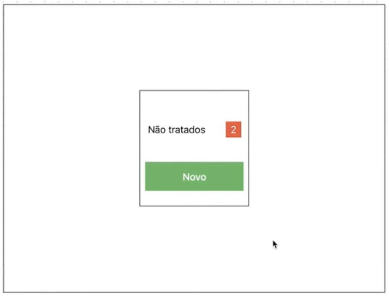
As you can see, to create this dashboard we will need a Board, with 2-3 components.
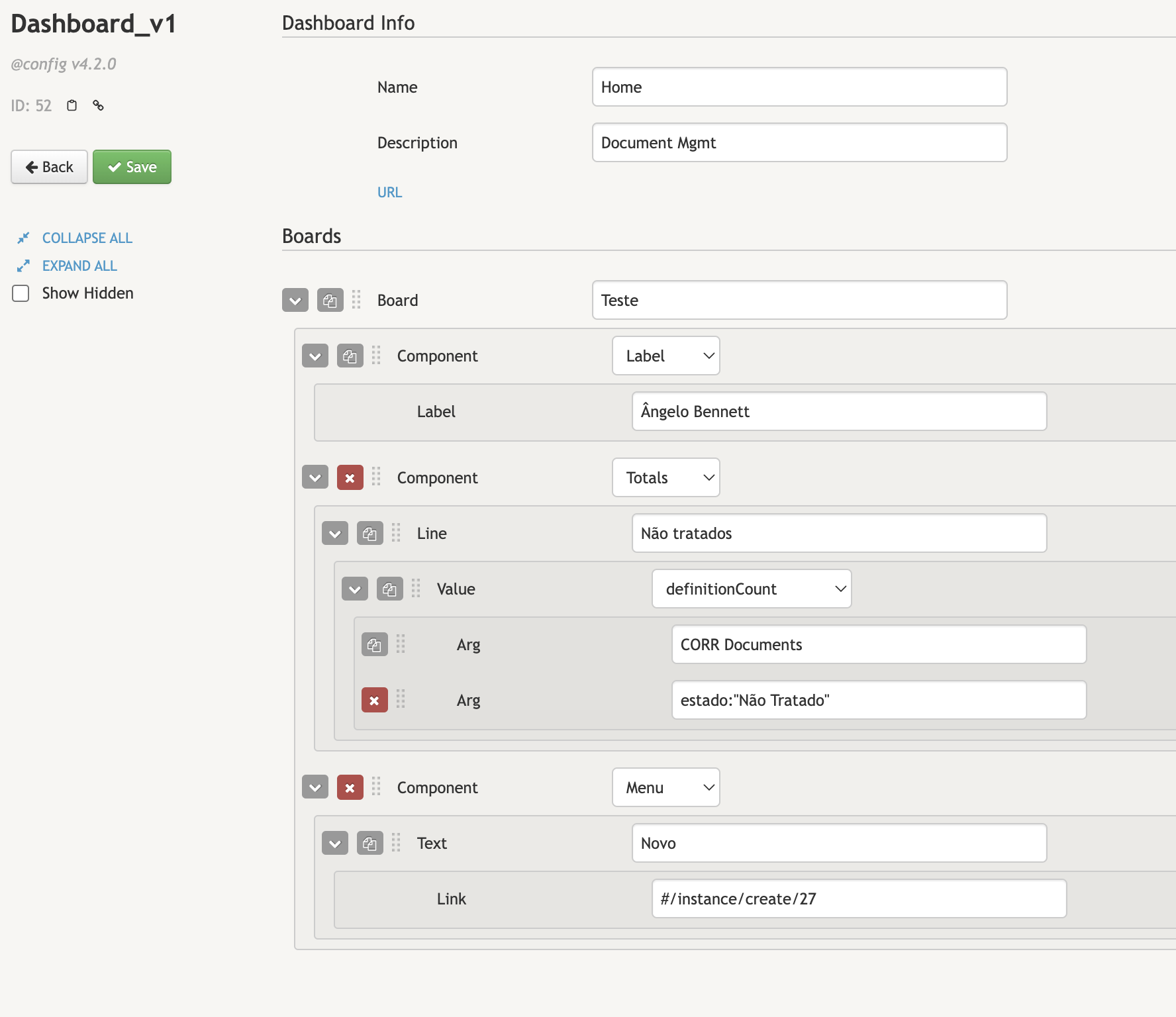
FIrst of all, a Label. Essentially a Label is just a text field for a dashboard, and as such that is the only input value that it has.
Next, in order to implement the "Não Tratados" and the number of Contracts that still need attention beside it, we will use a "Totals" Component.
To create a "Totals" component, we will need the text, which in this case is "Não Tratados", followed by the Value, which must be selected from the following types:
- definitionCount
- domainCount
- fieldSum
- fieldAverage
- fieldWeightedAverage
- dmEquipmentCount
- link
For this situation, we want a "definitionCount", which will count the number of records in a definition, which in this case will be the number of documents. We will also need to add another line to the definitionCount Arguments, and this next line will be a query. The query, as you probably expected, will be to filter the documents by "Não Tratado", in order to get a count of only the documents that require attention.
To accomplish this, we simply need to add the line estado: "Não Tratado".
Next, for the "Novo" button, which will allow you to create a new document. For this, we can use a "Menu" Component, adding a text field with the text we want to be displayed in the button ("Novo"), and then a link field inside the text field, which will contain a link to the creation of a new document.
After all these steps, our dashboard definition should look something like this:
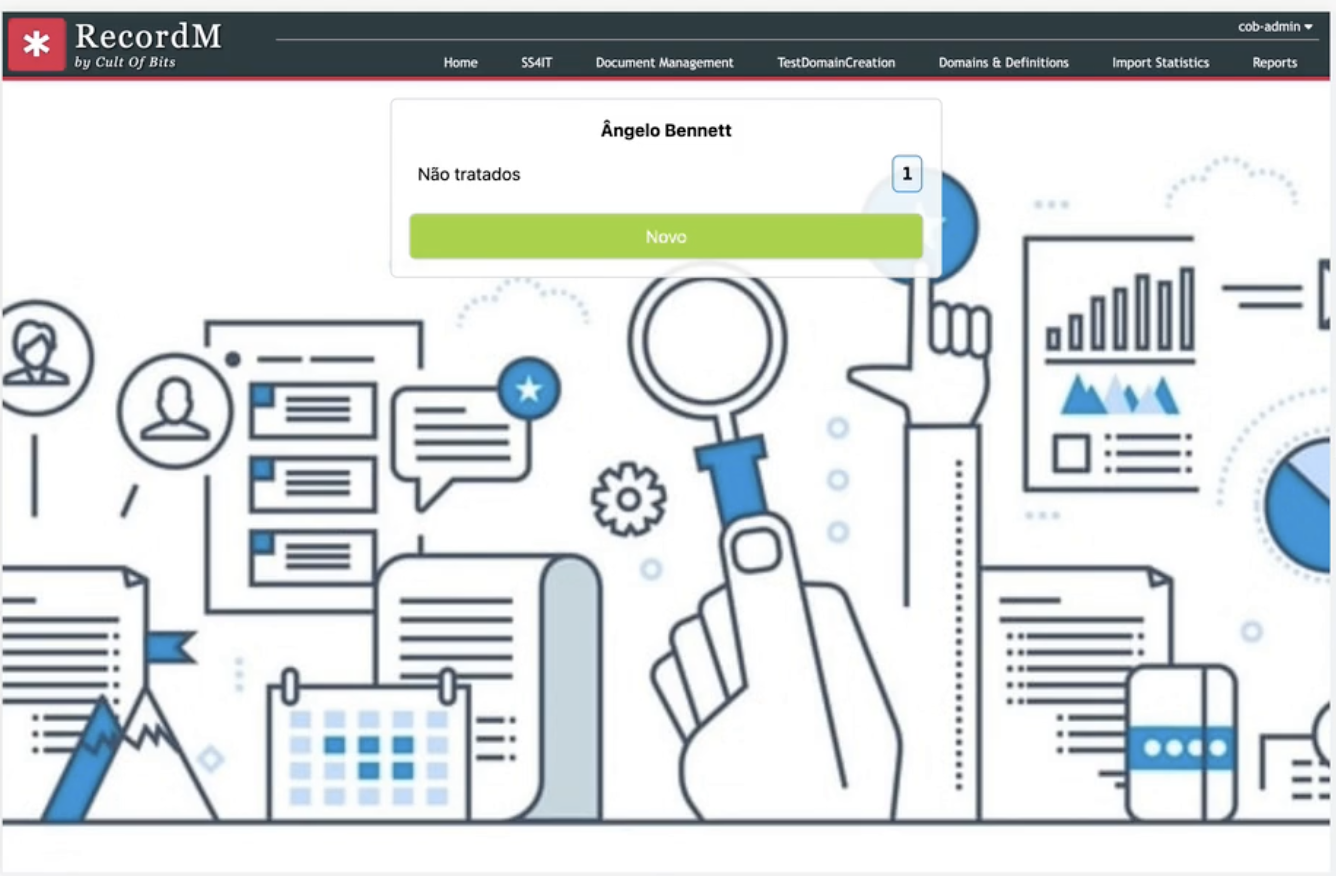
With that setup, our dashboard now looks like this:
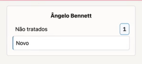
Following these steps, we just turned a simple dashboard design into a functioning dashboard in our recordM system, which lists documents that require attention, links directly to where these documents are upon clicking the button, and even includes a button to create new documents!
However, the appearance of the dashboard itself and the rest of the page is still very bare, and that leads us into our next section...
# Dashboard Customization - Intro
Upon first inspection, there do need seem to be any customization options for the dashboards. If that is the case, how can we change their appearance? You may not have noticed, but on the left side of the screen, there is a checkbox, titled "Show Hidden".
After clicking on this, many new options will have showed up, and using these hidden options are how we will customize our new dashboard.
Starting with the main customization options, found in the "Dashboard Info" tab:
- Classes
- Image
- Width
- Grid
- Access
- Context
# Image
# Image - Uploading and Using Images:
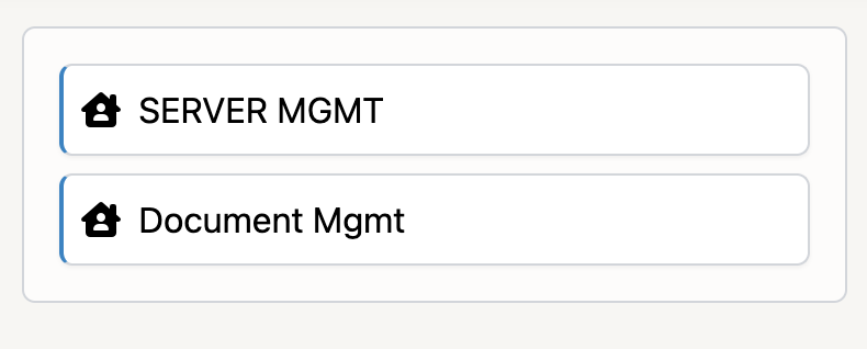
To upload a background image for a dashboad, we must return to the Home page, click on the "SERVER MGMT" dashboard in the chooser selection menu:
Then, we want to select the upload images icon in the Dashboards button:

This is where we upload images to be used in our dashboards, for example, as background images. To add an image, we simply need to create a new record, and inside that record upload the file.
Once it is uploaded, we copy the link of the file, and select the "Image" DashboardCustomize option, adding the link we copied here. After a refresh, the uploaded background image will appear.
# Access
If we select "Access" in the DashboardCustomize options, a new field will appear, named GroupAccess. By entering the name of a group here, we can control who has access to the Dashboard, which is a very important feature. In order to add multiple groups, you can create multiple Access fields.
# Width
After selecting the width option, a new field named "Width" will appear, along with some text telling us the default width value. For this section, you must be familiar with Tailwind CSS, since that is what is used to customize the dashboards. You can find the complete documentation here (opens new window), and using the search feature will be very useful.
For example, for this section, search for the Min-Width & Max-Width pages of the docs.
This width parameter controls the size of the current component. As we are in the Dashboard Info section, this controls the size of the entire page. Usually, the default is fine here, but feel free to experiment.
# Grid
Once again, in order to know what to add to this section, Tailwind CSS documentation is extremely useful.
Essentially, what Tailwind does is join multiple parts of code that would have to be added one by one into the style section in normal CSS, into classes that simply join all these things together for you.
Depending on what you put in this section, you can determine how your grid behaves, which is very useful. For example, you can set how the grid behaves depending on the size of the window, which basically means depending on the size of the window, it will also change the size of the dashboard.
# Classes
Once you check the classes option, a new field will appear, named "DashboardClasses". This section has many possibilities, and allows you to define things such as background color, whether the background image occupies the entire page or ony part of it, if the background should be filled or stretched, padding settings, etc...
This section is named classes, becuase all generic Tailwind classes relevant to whatever you are trying to edit the appearance of should end up here.
# Example
Now, to demonstrate the possibilities, let's return to our Document Management dashboard. At the moment, this is what it looks like:
However, it is all the way to the side of the page, in the top left, and the button is not very good looking. Let's try out some of the fields we just covered, and make it look better.
With a few changes to the BoardClasses, the Classes section of the dashboard itself, and the Classes section of the button (menu) Component, we can make it look like this:
# What was changed?
The Board classes were changes so that it is centered in the middle of the screen, and some padding was also added so that it is not touching the top.
The button (Menu) component classes were changed so that the background is green.
The text of the button (Menu) component classes were edited so that the text in centered in the middle of the button, and the text color changed to white.
Lastly, a background image was added.
These may seem like small changes, but the dashboard appearance and feel is completely different. Now, a user who is responsible for the documents has a dashboard he can go to which immediately shows him what work needs to be taken care of, which is immensely useful.