Calendar
The Calendar component allows you to display RecordM instances as events on an interactive calendar. It is built on top of FullCalendar and supports multiple views, event tooltips, instance creation, date range output, and Handlebars templating for advanced event rendering.
Defining the Calendar Component
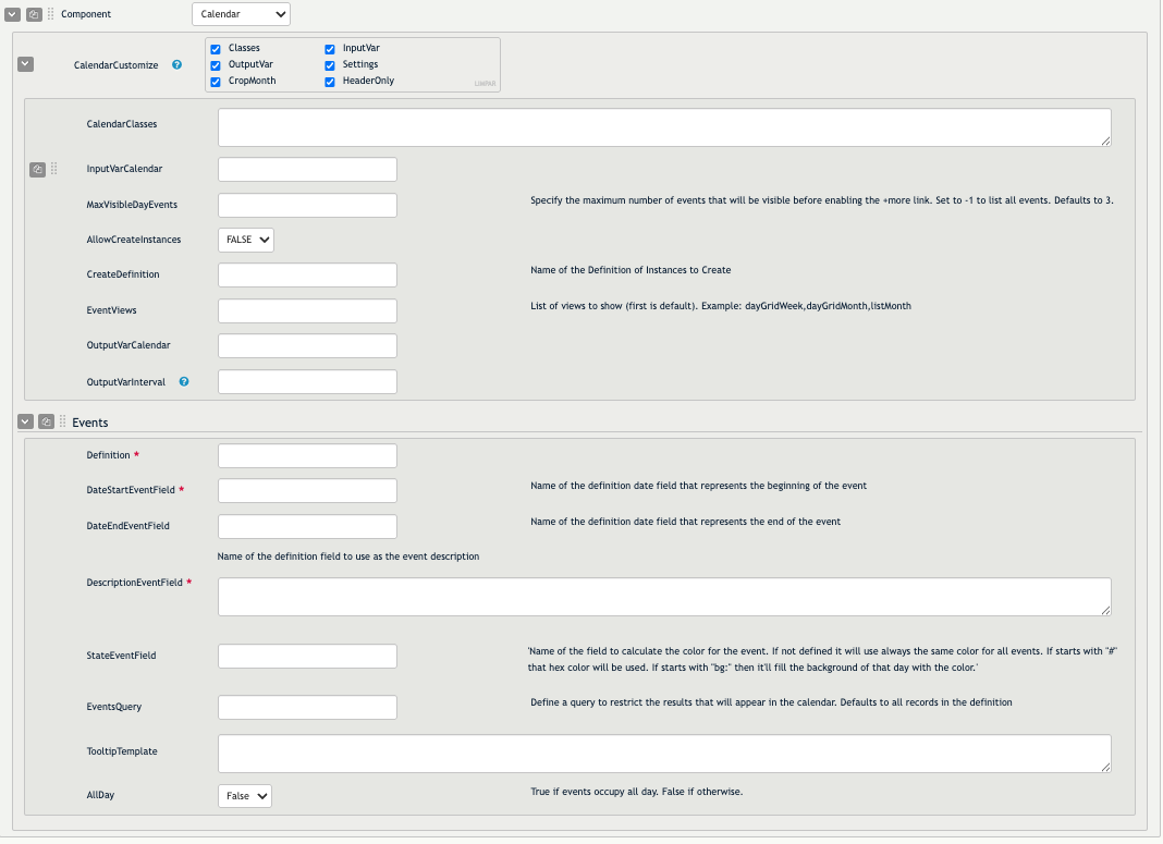
The Calendar component is split into two parts: the component settings (defined in the CalendarCustomize sub-instance) and one or more Event Sources, each describing a set of instances to display as events.
Component Settings
- CalendarClasses: Tailwind (or other) classes applied to the outer container of the calendar. Defaults to
p-4. - InputVarCalendar: One or more dashboard variables whose values are appended to the event query as additional filters. Useful for filtering displayed events based on selections made in other components.
- MaxVisibleDayEvents: The maximum number of events shown in a single day cell before a "+more" link appears. Defaults to
3. Set to-1to show all events without a limit. - AllowCreateInstances: When set to
TRUE, allows users to click and drag on the calendar to create a new instance in the definition specified byCreateDefinition. The selected date range is automatically pre-filled in the new instance form. - CreateDefinition: The name of the definition used when creating instances via calendar selection (requires
AllowCreateInstancesto beTRUE). - EventViews: A comma-separated list of FullCalendar view identifiers that determine which views are available in the toolbar (e.g.
dayGridWeek,dayGridMonth,listMonth). The first value in the list becomes the initial view. Defaults todayGridWeek,dayGridMonth,listYear. - OutputVarCalendar: A dashboard variable that is automatically updated with an Elasticsearch date range query reflecting the currently visible date range. Useful for passing the calendar's current range to other components.
- OutputVarInterval: A dashboard variable updated with an object containing
startDateandendDateas Unix timestamp strings, reflecting the currently visible range. - CalendarCustomize: A multi-value field that enables optional behavioral modifiers:
- CropMonth: When enabled, the date range used for event queries is snapped to exact calendar month boundaries — partial months at the edges of the view are excluded. This means only events belonging to the currently focused full month are fetched.
- HeaderOnly: When enabled, the calendar body is hidden by default and a Show/Hide toggle button appears in the toolbar, along with a date picker for navigation. This is useful when you want to use the calendar's navigation controls to drive other components (via
OutputVarCalendarorOutputVarInterval) without displaying the calendar grid itself.
Event Sources
Each Event Source defines a set of instances to render as calendar events. You can configure multiple event sources within the same Calendar component.
- Definition: The name of the RecordM definition whose instances will be displayed as events.
- DateStartEventField: The field in the definition that holds the event's start date (as a Unix timestamp).
- DateEndEventField: (Optional) The field that holds the event's end date. If omitted, events are treated as point-in-time. If set to the same field as
DateStartEventField, events are given a 1-second duration. - DescriptionEventField: The field used as the event label on the calendar. Supports Handlebars templating using the
{|{/}|}and{${/}$}delimiters for escaped and unescaped output respectively. - StateEventField: Determines the color of the event. Can be:
- A field name — the field's value is deterministically mapped to an RGB color.
- A hex color string (e.g.
#FF5733) — used directly as the event color. - Prefixed with
bg:(e.g.bg:StatusField) — applies the color as a background to the entire day cell instead of just the event chip (intended for marking holidays or full-day states). Saturdays and Sundays are excluded from this background.
- EventsQuery: An Elasticsearch query to filter which instances from the definition are shown. Defaults to
*(all instances). - TooltipTemplate: A Handlebars template rendered inside the tooltip that appears when a user clicks an event. If omitted, a default instance summary is shown. Supports the same
{|{/{${delimiters asDescriptionEventField. - AllDay: When set to
true, events are treated as all-day events and rendered without a time component.
Views and Navigation
The calendar toolbar adapts to the active view:
- In standard views (
dayGridWeek,dayGridMonth, etc.), the toolbar shows today, prev, and next navigation buttons plus the view switcher. - In
listYearview, the toolbar is replaced with a date picker (two date inputs) and custom prev/next/today buttons that shift the selected interval by the size of the current range. - In
HeaderOnlymode, the toolbar includes a Show/Hide toggle, a date picker, and prev/next/today navigation, while the calendar grid starts hidden.
The calendar automatically persists the active view and current date in component state, so users return to the same position after navigating away.
Event Tooltips
Clicking an event opens a tooltip anchored to the event element (or to the list item title in list views). The tooltip displays an instance summary by default, or a custom layout if TooltipTemplate is configured. Tooltips are interactive — links and buttons inside them are clickable.
Handlebars Templating
Both DescriptionEventField and TooltipTemplate support Handlebars templates. The template context includes all Elasticsearch fields of the instance, plus the following special properties:
| Property | Description |
|---|---|
_is_single_day | true if the event starts and ends on the same day |
_start_date_string | Start date formatted as D/M/YYYY |
_end_date_string | End date formatted as D/M/YYYY |
_dashboard | The current dashboard object |
_calendarView | The active FullCalendar view type (e.g. dayGridMonth) |
The template is evaluated at runtime against the instance data, meaning it can read field values and apply conditional logic. There are two delimiter pairs, each serving a different purpose:
{|{ field }|}— Evaluates the expression and renders it as HTML-escaped text.{${ field }$}— Evaluates the expression and renders it as raw, unescaped HTML.
TIP
When using Handlebars in DescriptionEventField, the event chip background becomes transparent, giving you full control over the rendered HTML appearance.
Using Handlebars Partials
You can also reference custom Handlebars partial templates defined elsewhere in your project. This is useful for sharing a consistent tooltip or event layout across multiple Calendar components without duplicating markup.
Use the {|{> }|} syntax to include a partial, optionally passing parameters:
{|{> my_templates/calendar_tooltip.hbs myParam='true' }|}The partial receives the same instance context as the inline template, plus any parameters you pass. This makes it easy to reuse a single template file across calendars while still being able to toggle sections via parameters.
Instance Creation
When AllowCreateInstances is set to TRUE, users can click or drag across days in the calendar to open a new instance form. The selected start (and optionally end) date are automatically pre-filled using the fields defined in the first Event Source (DateStartEventField / DateEndEventField).
INFO
Date selection is temporarily disabled while an event tooltip is open, to prevent accidental instance creation when clicking events.
Output Variables
The Calendar component can expose its current state to the rest of the dashboard through two output variables:
- OutputVarCalendar: Set to an Elasticsearch date range query string (e.g.
start_date:[1700000000000 TO 1702677599999]). This is based on the first Event Source'sDateStartEventField. - OutputVarInterval: Set to a JSON object
{ "startDate": "...", "endDate": "..." }with Unix timestamps as strings.
Both are updated whenever the user navigates to a different date or switches view.
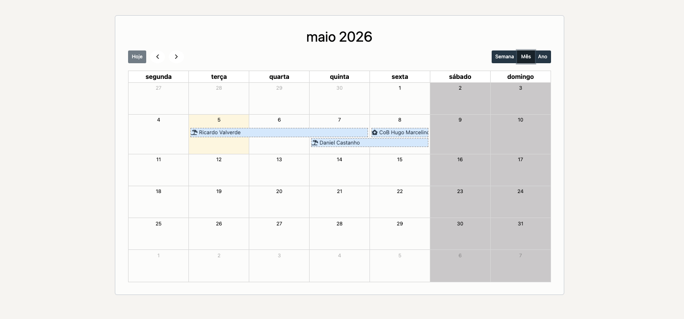
Example — Collaborator Absence Calendar
The following example shows a Calendar configured to display collaborator vacations and sick days from a definition named Calendário Colaborador. This definition represents absence days for a given collaborator - this could be due to vacations, sick days, etc.
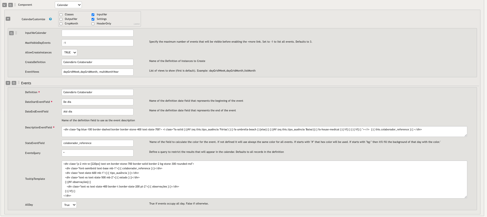
Component Settings
- MaxVisibleDayEvents is set to
-1so all absences are always visible in a day cell, with no "+more" truncation. - AllowCreateInstances is
TRUEand CreateDefinition is set toCalendário Colaborador, so users can drag across days directly on the calendar to register a new absence without leaving the dashboard. - EventViews is
dayGridWeek,dayGridMonth,multiMonthYear, making a full-year multi-month overview available in addition to the standard week and month views.
Event Source
- DateStartEventField and DateEndEventField are set to
De diaandAté diarespectively, with AllDay set toTruesince absences always occupy full days. - StateEventField is set to
colaborador_reference. Since this is a text field rather than a hex color, the calendar deterministically maps each collaborator's name to a unique color — making it easy to visually distinguish whose absences are whose at a glance. - DescriptionEventField uses a Handlebars template to render a contextual Font Awesome icon based on the absence type, followed by the collaborator's name:
<div class="bg-blue-100 border-dashed border border-stone-400 text-slate-700">
  <i class="fa-solid
    {|{#if (eq this.tipo_ausência 'Férias')}|}
      fa-umbrella-beach
    {|{else}|}
      {|{#if (eq this.tipo_ausência 'Baixa')}|}
        fa-house-medical
      {|{/if}|}
    {|{/if}|}
  "></i>
  {|{ this.colaborador_reference }|}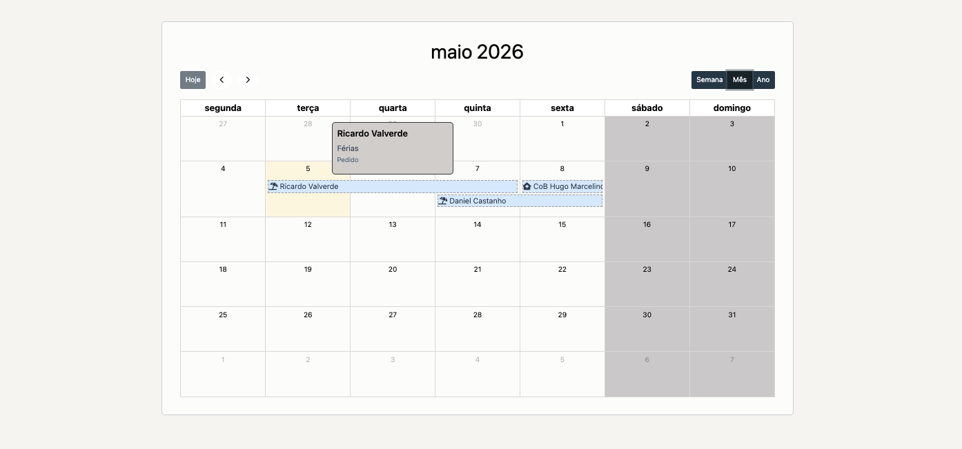
</div>- TooltipTemplate shows the collaborator name, absence type, approval status, and any notes when the user clicks an event. A solid border and stone background give it a distinct, card-like appearance:
<div class="p-2 min-w-[220px] text-sm border-stone-700 border-solid border-2 bg-stone-300 rounded-md">
  <div class="font-semibold text-base mb-1">{|{ colaborador_reference }|}</div>
  <div class="text-slate-600 mb-1">{|{ tipo_ausência }|}</div>
  <div class="text-xs text-slate-500 mb-2">{|{ estado }|}</div>
  {|{#if observações}|}
    <div class="text-xs text-slate-400 border-t border-slate-200 pt-2">{|{ observações }|}</div>
  {|{/if}|}
</div>
Output of the example
After clicking one entry in the calendar to show the tooltip: